
When it comes to news content, viewers may not first think of its presentation. If you’ve ever worked in a newsroom though, you know presentation is a big conversation behind the scenes.
“Should we make this a breaking news banner?”
“What graphic should we use?”
“What’s the first thing someone accessing the page should see?”
“How big should this paragraph be?”
“Should I pull this quote?”
That presentation can make a website beautiful to look at, easy to navigate and helps the viewer understand what the outlet thinks is a priority. Bad presentation can do exactly the opposite.
Let’s compare two outlets who have similar audience size, demographics and reputation: the Associated Press and NBC News.
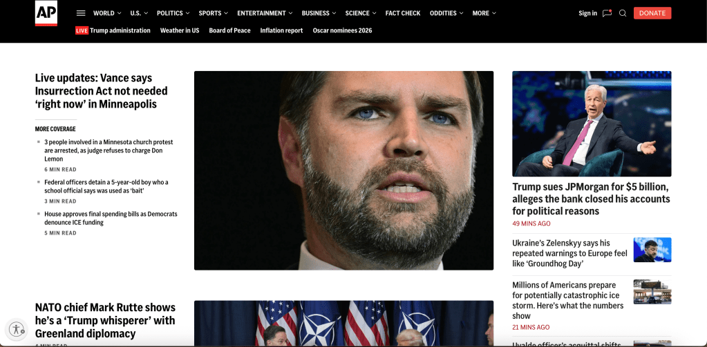
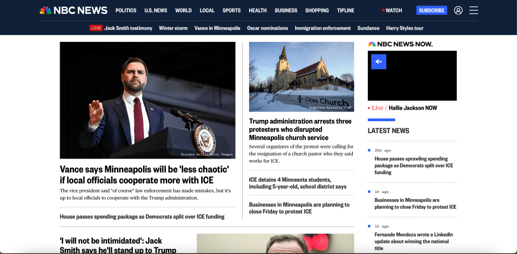
In my opinion, the Associated Press has a much stronger site. Here’s what they do good and where NBC falls short:
Margins
The AP has about .5 inch margins. NBC’s are 1.5. That’s 2 extra inches of space for content on the AP’s site.
White Space
With smaller margins, that also allows the AP to give their content more space to breathe. Meanwhile, all of NBC’s white space is spent on the 3 inch margins, making their site seem much more cluttered.
Photos
There are 4 photos fully visible on the AP’s site, only 2 on NBC, plus the video. AP has a dramatic hierarchy with these photos, while NBC’s size differs only by an inch or two. The stark size difference on AP makes it a much more interesting lay out.
Drop Head
NBC uses something called a “Drop Head” on some of their stories. That’s the little sentence blurb under the headline. It’s extra words and their headlines are good enough to stand without them.
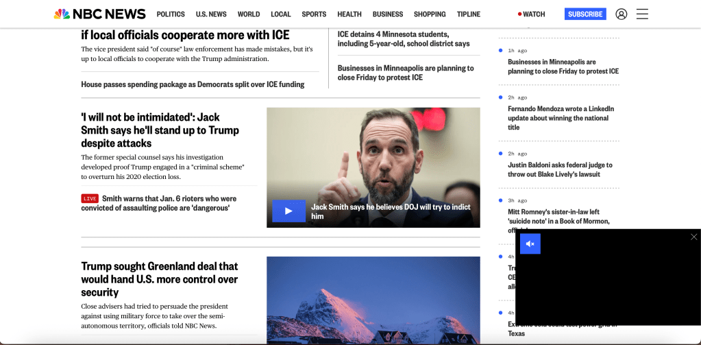
“Sticky” Elements
If you begin scrolling on NBC’s site, that video in the top right corner drops to the bottom right and follows as you scroll, taking up a significant amount of screen space. They do it within the articles themselves too and it’s very distracting.
Both sites have almost the same amount of stories visible when you first open them, 7 for the Associated Press and 8 for NBC. The AP’s design is just more thoughtful, making it much easier on the eyes.
This all isn’t to say NBC’s website is bad. They’re primarily a broadcast outlet, if their priority isn’t in web articles, that’s fine. There are just slight improvements that could be made to the site to make it more accessible and enjoyable for viewers.
Obviously the content of the copy is imperative in the news industry. We need to have clear, factual, concise text. But that doesn’t mean news organizations should be overlooking how their stories are presented either.

Leave a comment